
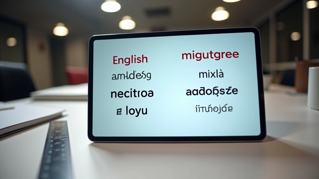
Choosing Web Fonts That Work Across Four Scripts
Learn how to evaluate typeface coverage for English, Chinese, Malay, and Tamil. Not all fonts support all scripts equally.
Chinese characters need more breathing room than Latin text. Tamil conjuncts require different spacing altogether. Here’s how to set up CSS that handles all four gracefully.
When you’re building a website that serves English speakers, Mandarin readers, Malay users, and Tamil audiences simultaneously, typography becomes exponentially more complex. It’s not just about picking a font and calling it done. Each script has its own requirements, its own visual weight, its own rhythm on the page.
The problem starts with line height. English text at 1.5 line-height looks spacious and comfortable. But Chinese characters with the same ratio feel cramped. They’re taller, wider, more densely packed. Tamil text with its characteristic ascenders and descenders needs its own calibration. You can’t use one setting for all four languages and expect professional results.
Then there’s character spacing—letter-spacing in CSS. Add 0.05em to improve Latin readability, and your Chinese text suddenly looks broken apart. Tamil conjuncts (those multi-character combinations) start separating in ways that change their meaning. The spacing that works for one script actively damages another.
Line height—the vertical space between lines of text—isn’t a one-size-fits-all setting. Different scripts have different visual weights and proportions.
English text uses what’s called “ascenders” (like the top of the letter ‘h’) and “descenders” (the tail of ‘g’). The ascender line and descender line define the space needed. Most English bodies use 1.4 to 1.6 line-height comfortably. That gives breathing room without wasting space.
Chinese characters, however, sit within a square box. Every character has the same height and width regardless of the actual glyph. A character like 國 is visually heavy—lots of strokes, dense information. When you put multiple characters in a row with English-standard line spacing, they feel cramped. You need at least 1.8 to 2.0 for comfortable reading. The characters are so information-dense that readers need more vertical space to process each line before moving to the next.
Malay uses Latin characters but with additional diacritics—marks above and below letters. These require more vertical space than plain English. You’re looking at 1.6 to 1.8. Tamil’s situation is different again. Tamil script uses complex conjuncts—multiple characters that combine into single units. These combinations can be quite tall. Tamil typically needs 1.7 to 1.9 for comfortable spacing.
The smart approach: Don’t use one line-height for all scripts. Use CSS language selectors or script-specific classes to target each language separately.

The specific line-height and letter-spacing values discussed here are recommendations based on typographic best practices for these scripts. Actual optimal values depend on your chosen typeface, font size, and audience preferences. Always test with real users reading in their native language. Different fonts within the same script family can have different requirements.

Character spacing—what CSS calls letter-spacing—is where things get genuinely complicated. A small increase can dramatically improve Latin text readability. But apply the same adjustment to Chinese or Tamil, and you’re breaking the text.
Here’s why: English relies on character shapes to distinguish words. When you add spacing between letters, it actually helps readers parse word boundaries faster. Your brain recognizes patterns more easily. Adding 0.04em to 0.06em to English body text makes it feel more refined and easier to scan.
Chinese doesn’t use spaces between words at all. The script relies on character boundaries being clear. Each character is a unit. When you add letter-spacing to Chinese, you’re literally breaking the natural reading flow. Characters that should be close together get separated. Readers slow down. Comprehension drops. Don’t add letter-spacing to Chinese body text—ever. Leave it at 0.
Tamil is more nuanced. The script uses conjuncts extensively—combinations like ക്ഷ where two or more characters merge into one visual unit. These conjuncts need to stay together. Even small letter-spacing can separate them visually, making text harder to read. For Tamil, use no letter-spacing, or at most 0.01em for emphasis in headings.
Malay can tolerate slightly more spacing than Chinese or Tamil because it’s Latin-based, but still less than English. Keep it under 0.03em for body text. Too much spacing looks awkward.
The practical solution is to use CSS selectors that target specific languages. HTML has a lang attribute that you can leverage in your stylesheets.
CSS language selectors approach:
:lang(en) {
    line-height: 1.6;
    letter-spacing: 0.05em;
}

:lang(zh) {
    line-height: 1.9;
    letter-spacing: 0;
}

:lang(ms) {
    line-height: 1.7;
    letter-spacing: 0.02em;
}

:lang(ta) {
    line-height: 1.8;
    letter-spacing: 0;
}
This approach requires that your HTML properly sets the lang attribute on the appropriate elements. If you have a paragraph in English, it needs lang=”en”. A Chinese paragraph needs lang=”zh”. A Tamil section needs lang=”ta”. Most modern CMS platforms handle this automatically, but it’s worth verifying.
An alternative approach uses class-based selectors if you can’t rely on lang attributes:


The numbers I’ve shared are starting points, not absolutes. Every typeface behaves slightly differently. A font designed specifically for Chinese will have different spacing needs than a generic font with Chinese support bolted on. Font metrics matter enormously.
You need to test with actual readers. Invite users who read each language natively to review your layouts. Ask them: Does this feel comfortable? Do you have to slow down? Does anything look broken? Their feedback beats any formula.
For English, aim for 50-75 characters per line at your chosen font size and line-height. For Chinese, 25-35 characters per line often works better because the information density is so much higher. Malay and Tamil fall somewhere between depending on their specific context.
Consider also that Singapore’s readers often switch between scripts within a single session. They might read an English headline, scan a Chinese paragraph, check a Tamil notification. Your spacing should feel cohesive even when the scripts change. That means visual rhythm matters—the overall impression of white space and text balance—more than achieving perfect numerical consistency.
You can’t set line-height and letter-spacing once and expect them to work beautifully across four different scripts. Chinese needs more vertical breathing room but zero character spacing. Tamil needs careful handling of conjuncts. English benefits from selective letter-spacing. Malay sits in the middle. The solution isn’t to find a compromise that’s mediocre for everyone—it’s to give each script what it actually needs through language-specific CSS rules. Your users will notice the difference immediately. Text that’s properly spaced feels professional. Text that’s been squeezed or stretched feels wrong, even if readers can’t articulate why. That’s typography working at its best.