
Choosing Web Fonts That Work Across Four Scripts
Learn how to evaluate typeface coverage for English, Chinese, Malay, and Tamil.
Fast connections don’t excuse slow font loading. Variable fonts and subsetting strategies keep your multilingual pages responsive, even with complex character sets.
Singapore’s internet speeds are among the fastest globally. Yet many websites still waste this advantage with unoptimized font loading. When you’re serving typefaces to support English, Chinese, Malay, and Tamil scripts simultaneously, file sizes balloon quickly. A single “comprehensive” font family covering all four scripts can easily exceed 500KB. That’s not just slow — it’s wasteful.
The real challenge isn’t bandwidth. It’s how you deliver fonts so users see content immediately. We’re talking about variable fonts that adapt to every script, strategic subsetting that removes characters you’ll never use, and async loading patterns that don’t block rendering. These techniques transform font loading from a bottleneck into something genuinely invisible.


Traditional font families require separate files for each weight and style. Want regular and bold in English? That’s two files. Add italic variants? Four files. Now multiply that across scripts with different weight requirements. Chinese characters need stronger visual weight at smaller sizes than Latin text. Tamil conjuncts need different spacing entirely.
Variable fonts collapse this complexity. Instead of shipping five separate files (regular, bold, italic, bold-italic for each script family), you ship one variable font that adjusts weight, width, and optical sizing continuously. Noto Sans is the gold standard here — it covers 90+ languages and scripts with a single variable font file. Yes, it’s larger than a single-script font. But it’s dramatically smaller than shipping multiple font families.
The practical advantage? You’re loading fonts once, then using CSS custom properties and variable font axes to adjust them per script. English headlines at 700 weight. Chinese body text at 500 weight. Tamil at 600 weight. All from one file. That’s efficiency.
Font loading optimization involves technical decisions that impact user experience. The techniques described here are based on current web standards and browser capabilities as of 2026. Actual implementation should be tested thoroughly across target browsers and devices. Variable font support varies — always provide fallbacks for older browsers.
Here’s where most developers miss a major optimization. You don’t need every character in a typeface. If your website uses English headlines, Chinese body copy, and Tamil footer text, you can subset your fonts to include only those specific characters. This isn’t about removing languages — it’s about being precise.
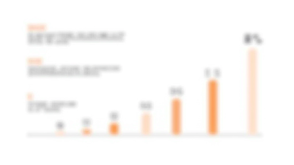
A full Noto Sans CJK file sits around 7-10MB. But if you’re only using simplified Chinese characters (roughly 3,500 of the 20,000+ in the full font), you can subset that down to 800KB. Add English latin characters, Tamil syllables, and Malay diacritics? You’re still looking at under 2MB for all four scripts. That’s a massive difference on 4G networks.

How you load fonts matters as much as which fonts you choose. The difference between blocking rendering and letting it happen asynchronously can be 500ms or more. You’ve got three main strategies here, and they’re not mutually exclusive.
The browser shows your fallback font immediately while the web font loads in the background. Users see text right away instead of waiting. There’s a brief flash when the real font loads, but that’s preferable to staring at a blank page. This is the default behavior for most modern browsers and it’s solid for Singapore’s networks.
Load your @font-face declarations asynchronously so they don’t block HTML parsing. Use for critical fonts (headlines, body text) but defer decorative fonts. This ensures your core content renders quickly regardless of font availability.
Your CSS font stack should reflect script requirements. English gets Georgia or Segoe UI. Chinese gets Noto Sans SC or system fonts. Tamil gets appropriate system fallbacks. Don’t force one font family for all scripts — let the browser choose wisely while your web fonts load.
You can’t optimize what you don’t measure. Three metrics matter for font loading: First Contentful Paint (FCP), Largest Contentful Paint (LCP), and Cumulative Layout Shift (CLS). Singapore’s networks are fast enough that font loading typically doesn’t impact FCP much. But it absolutely impacts LCP — that’s when users see your actual typography.
800-1200ms target
Fonts rarely impact this. Async loading handles it well. Focus on critical rendering path instead.
1.5-2.5s target
This is where fonts matter. Preload critical fonts. Subset aggressively. Use variable fonts to reduce requests.
<0.1 target
Font swapping causes shift. Reserve space with size-adjust CSS property. Prevent surprise reflows when fonts load.
Use Chrome DevTools or WebPageTest to measure these metrics on actual 4G connections, not your fiber connection. You’ll see where fonts actually impact real users. Most of the time, subsetting and smart loading eliminate font-related delays entirely.
Let’s say you’re building a site for a Singapore tech startup. They need English headlines, Chinese body copy, and Tamil footer text. You’d load Noto Sans Variable (covering all three) but subset it aggressively. Your CSS would use font-display: swap to show fallbacks immediately. Preload the subset for critical fonts. Defer non-critical font weights.
The result? First Contentful Paint hits around 900ms on 4G. Largest Contentful Paint around 1.8s — mostly determined by image loading, not fonts. Cumulative Layout Shift stays under 0.05 because you’ve reserved space for your custom fonts. Users see text in a system font almost instantly, then it smoothly transitions to your brand font without jarring shifts.
That’s optimization done right. It’s not about the fanciest fonts or the most advanced techniques. It’s about matching technology to actual user needs. Singapore’s networks are fast, but that’s not an excuse to be wasteful.

Fast networks in Singapore don’t mean you can ignore font performance. In fact, they raise expectations. Users notice when pages feel snappy, and they notice even more when they don’t. Variable fonts, strategic subsetting, and smart loading patterns aren’t optional extras — they’re foundational to professional web typography.
The techniques we’ve covered work together. Variable fonts reduce file count. Subsetting reduces file size. Async loading prevents blocking. Font-display: swap keeps pages responsive. Measured metrics confirm it’s working. None of these are complex. None require exotic tools. They’re just thoughtful decisions that add up to a genuinely better experience for every user, regardless of their connection speed.